Product design2025
Tidewater
Redesigning a mobile banking app around the three things people actually check every day.
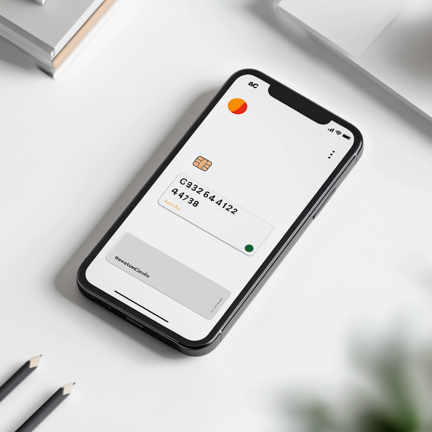
The brief
Tidewater is a digital bank with a loyal customer base and an app that had grown by addition for six years. Every new feature had earned a place on the home screen, and the result was a dashboard nobody could scan. The team asked for a redesign that would make the app feel calm again without removing anything people relied on.
Approach
Usage data and twenty customer interviews told a simple story: most sessions lasted under forty seconds, and almost all of them checked one of three things, the balance, the last few payments or an upcoming bill. We rebuilt the home screen around those three answers and moved everything else one tap away.
- A glanceable home screen with the balance, recent activity and what is due next.
- A rebuilt card area with freeze, limits and replacement in one place.
- A design system of 60 components shared by the iOS and Android teams.
Outcome
Average time to find a payment dropped from 22 seconds to 6 in moderated tests, and support tickets about frozen cards fell by a third in the first quarter after launch.