Branding2026
Halden Coffee Roasters
A bold, tactile identity and pouch system for a small-batch roaster that wanted to stand out without shouting.
The brief
Halden roasts around forty kilos of coffee a week in a former bike workshop in Aarhus. Their beans were winning blind tastings, but on a crowded café shelf the brown kraft bags looked like everyone else's. They wanted a brand that felt as considered as the coffee, and packaging that could flex across a rotating menu of single origins without a redesign every season.
Approach
We started with a week behind the counter, watching how people actually chose a bag. Most of them read the colour first, the origin second and the tasting notes last. That order became the system.
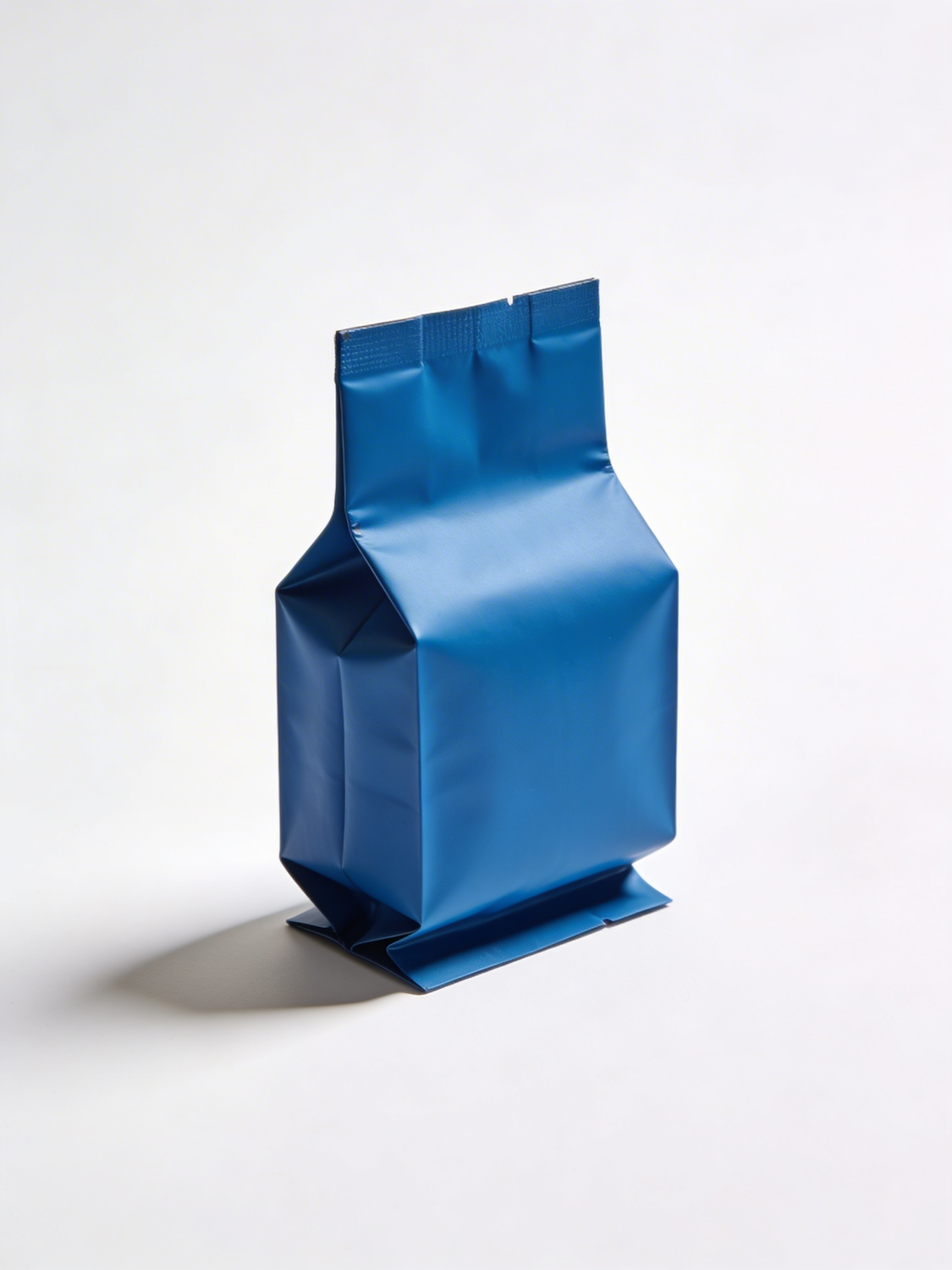
- A single saturated cobalt for the core range, so the shelf reads as one confident block.
- A modular label that swaps origin, process and tasting notes without touching the layout.
- A custom wordmark drawn from the stencil lettering still painted on the workshop door.
Outcome
The new range launched in four cafés and the online shop in spring. Halden now briefs a new origin in an afternoon instead of a fortnight, and the blue pouch has become the thing regulars ask for by name.